Answer this... What Is Your Opinion?

85 replies
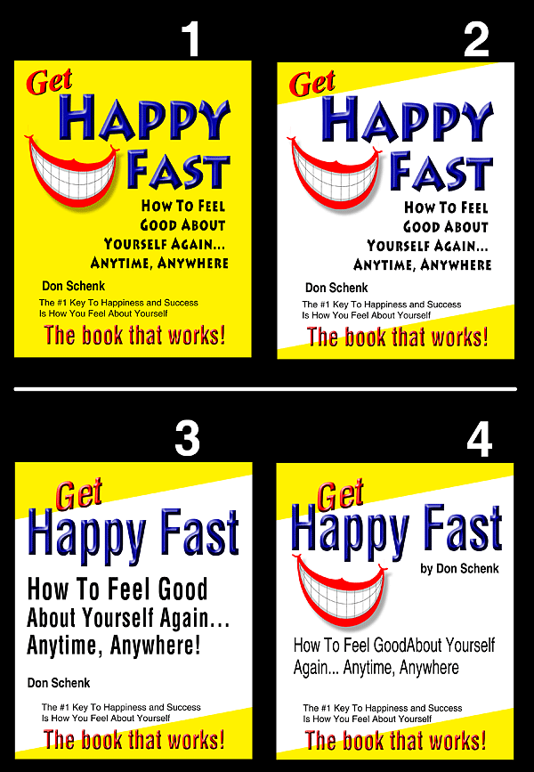
Which of these four (images are below) is your favorite for a Kindle book cover? #1, #2 , #3, or #4.

The Kindle sub-forum here at the WF is a great place to get your Kindle questions answered...

...but I put this question into the main forum because it is a general population question, and at any one moment a larger number of folks are here than are in the Kindle sub-forum.

Some 24 years ago, a chance remark from a friend gave me an ah-ha moment. I used the concept to develop a system, and I now have 24 years worth of documentation as to how well it works.

It is now time to put the system into a Kindle, and after KDP select, turn it into a printed book.

Do you see any "problems" with any of these covers?

Thanks

:-Don
#answer #opinion
  • Profile picture of the author Backlinko
    I vote for 4.
    Signature
    Find Awesome Keywords...Without ANY Tools
    {{ DiscussionBoard.errors[7534826].message }}
    • Profile picture of the author Matt Morgan
      Hello Don, I will give my honest opinions on each 4 of them, and also the one i like the best:

      1 = Too much yellow, too shocking to the eye
      2 = Nice and clean, with a white middle, with a picture of a smile
      3 = Same as 2, nice and clean but the black font is easier to read
      4 = This looks like everything on the image is just randomly scattered.


      I go for 2, as a picture tells a thousand words, so the red smile is good
      and the black font is clear and easy to read, as it is bold, and the whole image flows smoothly.


      Ps I love the end statement, "the book that works"

      so once again I go for 2:
      Matt Morgans opinion, "whose marketer whose method works"
      Signature
      -> [FREE WSO 1] Discover 77 FREE Ways To Generate Traffic!
      -> [FREE WSO 2] Discover 67 Killer Traffic Methods Which Will Crush Your Competition!
      -> [FREE WSO 3] Discover 77 Amazing Blogging Tips To Explode Your Profits!

      ...…..Now LISTEN CAREFULLY! ===> [WSO REPORTS 4, 5, 6 are >> Found Here]
      {{ DiscussionBoard.errors[7536122].message }}
  • Profile picture of the author wordpressdoctor
    I really like #2
    Signature
    ****** LEARN HOW WE MAKE OVER $5,000 PER MONTH****** SELLING UNIQUE ARTICLES ON FIVER AND OTHER FORUMS. THIS TOOL CAN CREATE OVER 500 UNIQUE ARTICLES, IN SECONDS, FOR ANY NICHE!
    {{ DiscussionBoard.errors[7534849].message }}
  • Profile picture of the author Gengis
    I like #1 the best. As far as problems I don't really see any, maybe you can split test it by doing this cover with this title and a different more catchy title for the book and see what woks best.

    Good luck Don!

    Gengis
    Signature
    My Craigslist Arbitrage Method Of Making Money On Demand -->

    http://www.warriorplus.com/w/v/f2fwlp
    {{ DiscussionBoard.errors[7534854].message }}
  • Profile picture of the author J50
    Number 1 draws in the eyes more I think. You should try the Tim Ferriss's method of split testing book covers by seeing which one gets clicked on more. I believe it was simple tests like this that contributed to some of his success.
    {{ DiscussionBoard.errors[7534879].message }}
  • {{ DiscussionBoard.errors[7534887].message }}
    • Profile picture of the author Alexa Smith
      Banned
      I vote for #3 (avoiding both "all-yellow" and the smile picture, which reminds me a little of cosmetic dentistry promotions ).

      I don't think any of them is bad, but I really like #3.

      Who's going to be the first to offer the fatuous observation that "testing" is the only real answer? Oops, it was probably me ...
      {{ DiscussionBoard.errors[7534904].message }}
  • Profile picture of the author KenThompson
    Hey Don,

    I'm with Alexa about #3. The absence of the smiling teeth. More than that, "How to Feel Good" stands out more than in the others. I think that will capture attention.

    I also agree with the premise that much about success, in any area, has a direct correlation with how you feel about your self.

    Give us a shout when it's available to purchase.

    Thanks,

    Ken
    {{ DiscussionBoard.errors[7534932].message }}
  • Profile picture of the author Joey Starkey
    I normally agree with Alexa..........But I am afraid that #2 works best for me.
    {{ DiscussionBoard.errors[7534935].message }}
  • Profile picture of the author Rsberg
    My vote goes with #2
    {{ DiscussionBoard.errors[7534942].message }}
  • Profile picture of the author Shubh Ashish
    #2 is the most Professional one out of the 4 and very Eye catching Too.
    Signature
    Sell Dreams, Not Products
    - Steve Jobs
    {{ DiscussionBoard.errors[7534951].message }}
  • Profile picture of the author Corey Geer
    Well, #2 does look more professional but please don't use Bevel and Emboss. Out of those 4, I guess :\
    Signature

    Skype: Coreygeer319

    {{ DiscussionBoard.errors[7534958].message }}
  • Profile picture of the author retsced
    #3 as it stands.
    #2 if the smile showed less dentures.

    or maybe #5

    Signature
    Strong Men and Women put themselves in harms way
    for the freedoms weak people give away for safety
    {{ DiscussionBoard.errors[7534967].message }}
  • Profile picture of the author marketingva
    I like #4 but instead of the smile (which is a bit cheesy IMO) I'd like to see a headshot of a smiling person. The colors of white/yellow really work for me. Like the way they pop together.

    Bonnie
    Signature

    Magic Wand Author Services helps writers polish their manuscripts and connect to readers.
    http://www.mwauthorservices.com

    {{ DiscussionBoard.errors[7534975].message }}
    • Profile picture of the author Kay King
      #4 - can't really say why but just followed my own preference
      Signature
      Saving one dog will not change the world - but the world changes forever for that one dog
      ***
      One secret to happiness is to let every situation be
      what it is instead of what you think it should be.
      {{ DiscussionBoard.errors[7535058].message }}
      • Profile picture of the author Irish Intuition
        Sorry Don, but I'd like #2 with #3's font

        The smile is a little cheesy
        Signature


        {{ DiscussionBoard.errors[7535067].message }}
  • Profile picture of the author agmccall
    I like either 2 or 4 but, I would darken the red on the lips, but that is just my opinion

    al
    Signature

    "Opportunity is missed by most people because it is dressed in overalls and looks like work." Thomas Edison

    {{ DiscussionBoard.errors[7535069].message }}
  • Profile picture of the author rosetrees
    I prefer #1. I find the white stripe on the other 3 breaks up the text and makes them harder to skim read.
    {{ DiscussionBoard.errors[7535071].message }}
  • Profile picture of the author Deacon Blues
    Had to be #2, it definitely looks the most professional
    Signature
    Interview about circumnavigating in a 41' sailboat

    Keep the kids busy & learning while you work
    {{ DiscussionBoard.errors[7535075].message }}
  • Profile picture of the author travlinguy
    #1.

    However, none of them are optimized for Kindle. When any of those covers are shrunken to thumbnail size your name won't be legible and it will be hard for the reader to know what the book is about because the subtitle will be barely legible if at all.
    {{ DiscussionBoard.errors[7535076].message }}
  • Profile picture of the author IM Lover
    I think that the #1 is the best, go with that one it's the best.
    {{ DiscussionBoard.errors[7535143].message }}
  • Profile picture of the author TomYevsikov
    I'll vote for #2

    It's eye catching and easy to read and understand at the same time.
    {{ DiscussionBoard.errors[7535185].message }}
    • Profile picture of the author GlenH
      #3 hands down
      {{ DiscussionBoard.errors[7535216].message }}
      • Profile picture of the author Alexa Smith
        Banned
        The score so far ...

        Number 1: 5 votes
        Number 2: 9.5 votes
        Number 3: 4 votes
        Number 4: 3.5 votes
        New versions offered: 1
        Valuable/essential side-comments: 1 (in post #20 above)

        So much for "Ask the audience". Next stop: play your 50/50 or "phone a friend" ...
        {{ DiscussionBoard.errors[7535439].message }}
  • Profile picture of the author JohnMcCabe
    Since this is an opinion question, I'm answering before anyone else's answer influences mine.

    If those are my four choices, I pick #2. Given the option, I would make the two 3D lines with the same effect. The red text with the black drop shadow hits me more than the other effect. #1 is too monochromatic - all I really notice is a big block of yellow. #3, #4, the 3D text washes out for me.

    Edit: Now that I've read through the other comments, I agree with travlinguy about the subtitle washing out in a thumbnail. And I believe the cartoon dog is a copyrighted and trademarked comic strip character, which would need to be licensed...
    {{ DiscussionBoard.errors[7535457].message }}
  • {{ DiscussionBoard.errors[7535465].message }}
    • Profile picture of the author angshuy2k
      My vote goes for # 2, like that one for some reason.
      {{ DiscussionBoard.errors[7535475].message }}
  • Profile picture of the author IndomitableD
    Cover #2. Most eye-catching.

    And if you don't mind... is the Warrior Book (Kindle Publishing/Brainstorming) forum active at all? From "outside" it doesn't look like the Thread or Post count has budged for some time.

    Congrats and good luck on your launch.
    {{ DiscussionBoard.errors[7535610].message }}
    • Profile picture of the author Alexa Smith
      Banned
      Originally Posted by IndomitableD View Post

      is the Warrior Book (Kindle Publishing/Brainstorming) forum active at all?
      Yes - very much so. 25 threads have had new posts just since Christmas (and I don't mean one post each).
      {{ DiscussionBoard.errors[7535627].message }}
  • Profile picture of the author clik2000
    #4 looks good to me !
    Signature

    Allen

    {{ DiscussionBoard.errors[7535621].message }}
  • Profile picture of the author cashcow
    I like #2 although what travlinguy said should be considered and the cover reworked.

    Also, you don't need to wait for KDP select to be over to get your book into print - the exclusivity restriction for select applies to electronic copies of your book only. Some of my print books outsell the kindle version by a significant amount so don't wait to publish it in print.
    Signature
    Gone Fishing
    {{ DiscussionBoard.errors[7535625].message }}
    • Profile picture of the author Joe Stewart
      Originally Posted by cashcow View Post

      I like #2 although what travlinguy said should be considered and the cover reworked.

      Also, you don't need to wait for KDP select to be over to get your book into print - the exclusivity restriction for select applies to electronic copies of your book only. Some of my print books outsell the kindle version by a significant amount so don't wait to publish it in print.
      Hi Lee,

      I like #3, but agree about the cover being reworked. I recently read that even though the Kindle Fire is in color, the original Kindle is still in black and white and many of the original owners haven't upgraded. I don't own either one, so I honestly don't know.

      If that's the case, then I'd think that some very plain, but large font with bold color that would stand out might be more effective than pretty graphics that many people can't see.

      I'm asking you because you're the "Kindle Queen". :-)

      Is that correct? Does it make sense?

      Joe
      Signature

      My New "Share All" Blog Is Coming Soon! Online & Offline Marketing, More!

      http://www.UnCENTSored.com

      {{ DiscussionBoard.errors[7535850].message }}
  • Profile picture of the author Sue McDonald
    I go for number 2. I find number 1 a bit harsh with that all over yellow.
    {{ DiscussionBoard.errors[7535636].message }}
  • Profile picture of the author scarob2
    I vote for #2.
    {{ DiscussionBoard.errors[7535638].message }}
  • Profile picture of the author John Rogers
    #1 with #2 as a close second.
    {{ DiscussionBoard.errors[7535644].message }}
  • Profile picture of the author Greg guitar
    I prefer #3 out of the choices, but let me give my honest first impression of all of them: they look very dated to me, because they remind me of book covers of the 1950s. I would prefer something with nicer graphics; maybe a good pic of a happy person or group, also I'd prefer the title was more specific; like "30 Days To A Happier Life" with sub: "Feeling Great About Yourself In 7 Simple Steps", or something like that.
    {{ DiscussionBoard.errors[7535691].message }}
  • Profile picture of the author eboniyham01
    Team #2 Pic!
    {{ DiscussionBoard.errors[7535694].message }}
  • Profile picture of the author 8485marketing
    I go for number 2 but I would put the bottom text into the yellowed area.
    Interesting and catchy cover though! Good luck with the release.
    Signature
    If you've been looking for a way to get started with an information marketing business then your search is well and truly over. Here is everything you need to get started online.
    Join My 30 Day Challenge
    {{ DiscussionBoard.errors[7535707].message }}
    • Profile picture of the author scrunchie
      I like number 2 best.
      {{ DiscussionBoard.errors[7535760].message }}
  • Profile picture of the author tryinhere
    # 2 / where's the poll at the top to keep score ?
    Signature
    | > Choosing to go off the grid for a while to focus on family, work and life in general. Have a great 2020 < |
    {{ DiscussionBoard.errors[7535767].message }}
    • Profile picture of the author Cali16
      I vote for number 2. However, that Cheshire cat-like floating smile is a bit off-putting. I'd keep the format of that cover but change the image to something much nicer (not a cartoon graphic) and far less cheesy.
      Signature
      If you don't face your fears, the only thing you'll ever see is what's in your comfort zone. ~Anne McClain, astronaut
      {{ DiscussionBoard.errors[7535778].message }}
  • Profile picture of the author HammerNiko
    2 and if you choose it give me a review copy
    Signature
    ***** HiTeBooks.com***** - Download 2000+ PLR eBooks for Free! /// Buy Google Adwords Accounts with $70 Ad Credit for $35
    {{ DiscussionBoard.errors[7535797].message }}
  • Profile picture of the author Dennis Gaskill
    Number 2 ... and we all expect you to divulge what your "system" is for all the help we've given you.
    Signature

    Just when you think you've got it all figured out, someone changes the rules.

    {{ DiscussionBoard.errors[7535828].message }}
  • Profile picture of the author tofrar
    Aaaaannnnnnd here come the votes from Iceland. 4
    Signature

    Wan´t to Guest post on clean authority Travel blog and get tweet with your link for Only 5 USD ?
    http://www.fiverr.com/belive/guest-p...weet-your-link

    {{ DiscussionBoard.errors[7535831].message }}
  • Profile picture of the author Paul Myers
    Personally, #3.

    The promise is clearer and easier to see. It will actually be readable on thumbnails.
    Signature
    .
    Stop by Paul's Pub - my little hangout on Facebook.

    {{ DiscussionBoard.errors[7535863].message }}
  • Profile picture of the author etelligent
    Number 3, but you should put the smile, but small on the bottom right
    {{ DiscussionBoard.errors[7535875].message }}
  • Profile picture of the author Joan Altz
    #2 is the best imo. I like the text wrapping around, bigger font, and the yellow highlights. Nice combo with that one.

    I disagree with everyone who likes #3. It's a boring ecover without the mouth.
    {{ DiscussionBoard.errors[7535932].message }}
  • Profile picture of the author Lloyd Buchinski
    I prefer 3, mostly because I don't really like the smile.
    Signature

    Do something spectacular; be fulfilled. Then you can be your own hero. Prem Rawat

    The KimW WSO

    {{ DiscussionBoard.errors[7535938].message }}
  • Profile picture of the author moneyman2010
    Hey Don.. Go with # 2 ..It stands out the best !
    {{ DiscussionBoard.errors[7535969].message }}
  • Profile picture of the author Joan Altz
    Also, remember that you are asking the opinion of Internet Marketers, most of whom do a lot of copywriting with minimal graphics on the page (not all, of course, but certainly the majority).

    But just use some common sense. If you have a plain ecover like #3 and you have it listed with other ebooks, how many people do you think are going to actually hone in on that ecover? Probably damn few.

    But the mouth, like it or not, draws attention so that the ecover stands a chance of having the title and subtitles read. And the wrap of the text in #2 naturally makes the eyes follow the text on down.

    Bigger is also better when it comes to titles, and that's why #4 is not as good #2. And you don't want all yellow as in #1.

    So again, my opinion is you will have a greater chance of attracting some attention with #2.
    {{ DiscussionBoard.errors[7536027].message }}
  • Profile picture of the author Don Schenk
    Wow! Thank you everyone.

    I ran out of "thanks" at post #18.

    The original cover (not shown here) was one I wanted to use just for the Kindle book image at Amazon, and contained only the title and one subtitle. I realize the covers I put here at the WF are the wrong proportions for Kindle.

    I almost fell out of the chair laughing at retsced's version. Too funny.

    I am of mixed mind (or mixed up mind) over the Cheshire Cat cheesy smile. It does pull the eye, but with what message?

    I found good stock photos of smiles, most are of women. Since I believe the market for this book is both male and female, I might be able to use a photo of a group of smiling people.

    Cory, why not bevel, and what would be better? I'm always learning.

    Lee, thank you. I didn't realize KDP Select only applied to electronic. The images here are in a 4:5 aspect ration, and I will want to go with 6x9 for printed.

    My wife doesn't care for the teeth. Perhaps I should draw a key on them and have "wind-up" teeth.

    Images do pull the eye, but I'm not sure what to use there.

    I did look at the printed books, bestsellers at Amazon in this catagory, and among the top 60 books, 24 (40%) had cartoon drawings.

    Let me go polish my flipping-coin so I can decide - heads/tails. Ah, perhaps adwords ads to test a couple different titles, and send people to make a book cover choice.

    Keep the ideas coming. I'm still reading.

    :-Don
    {{ DiscussionBoard.errors[7536097].message }}
  • Profile picture of the author TerranceCharles
    #2 and #4 are the best ones, but out of that I vote for #2, has a cleaner look and feel
    {{ DiscussionBoard.errors[7536246].message }}
  • Profile picture of the author MareeZAR
    I feel number 2 is the best.
    1 has to much yellow and 3 really would look better with a smile
    Between 2 and 4, 2 is more visible.
    {{ DiscussionBoard.errors[7545836].message }}
  • Profile picture of the author Devin X
    Banned
    #1

    Keep It Simple, Silly.
    {{ DiscussionBoard.errors[7545873].message }}
  • Profile picture of the author SFM Champ
    2, but I'm not sure why.
    Signature

    I have been an active member of The Six Figure Mentors since early 2011 where I actively mentor others in the promotion and sales of high ticket products using the latest online and offline marketing strategies in addition to tried and tested classic strategies.

    {{ DiscussionBoard.errors[7546205].message }}
  • that would be 4
    Signature
    PatrickBrianONeill.com
    {{ DiscussionBoard.errors[7546255].message }}
  • Profile picture of the author Don Schenk
    Thank you. Keep them coming. I'll show you all the scores in a couple days from now.

    I am ordering a set of drawings of cartoon faces (head & shoulders) to see how they look as compared to the smiling dentures! Then I will stick each of 3 covers (teeth, faces, no drawing) on web pages and throw some adwords at them.

    "More will be revealed."

    :-Don
    {{ DiscussionBoard.errors[7546368].message }}
  • Profile picture of the author Skribblez
    I like #1 - eye catching
    Signature
    STYLE BAKERY | Style Baked Fresh Daily
    {{ DiscussionBoard.errors[7546385].message }}
  • Profile picture of the author anandshaw
    I prefer 3, because "happy fast" is not too intuitive to me. but the bigger "how to feel good about yourself...." makes sense.
    {{ DiscussionBoard.errors[7546424].message }}
  • Profile picture of the author donza
    I like 4 the best. But all of the ones with a smile would be okay
    {{ DiscussionBoard.errors[7546594].message }}
  • Profile picture of the author BeeJay
    I don't know that its my 'favourite' as such but my eye was drawn to #1. All yellow might not look savvy but it's attention grabbing for that reason. I also found it the easiest to read the title and description, which is what you want, because that's what's likely to get people to click on it.

    I can only speak for myself, but I buy at least a couple of kindle books a week, and I couldn't care less what the actual cover looks like. The content is what draws me in, because once they hit my kindle it's all white pages and text anyway.

    Not that we should have crappy covers or anything, but I guess what I'm saying is that getting the attention of buyers scanning search results is pretty important.
    {{ DiscussionBoard.errors[7551997].message }}
  • Profile picture of the author Claire Koch
    # 1 biggest smile, black white and yellow are bold and yellow brings the happy feeling out the best. You see allen has always used red and black in most of his marketing (theres a method behind that man that works).

    Edit: I would see how black works for the big letters you have in blue too just to see it.
    {{ DiscussionBoard.errors[7552086].message }}
  • Profile picture of the author JeremiahSay
    To me.. all of the examples you gave are good. But if given a choice, I would go for #2.

    Good luck with your publication.
    {{ DiscussionBoard.errors[7552167].message }}
  • Profile picture of the author raffman999
    I think number 2 is the best.
    {{ DiscussionBoard.errors[7552195].message }}
  • Profile picture of the author saloni
    3rd and 4th are good to go with...
    {{ DiscussionBoard.errors[7552322].message }}
  • Profile picture of the author Alminc
    I like #2.
    Signature
    No links :)
    {{ DiscussionBoard.errors[7552564].message }}
  • Profile picture of the author Robert T Jillie
    I vote for 3. The others look like teeth whitening adverts!...
    Signature
    Never Give Up, Be Confident In What You Do.

    There may be tough times, but the difficulties which you face
    will make you more determined to achieve your objectives
    and to win against all the odds.
    {{ DiscussionBoard.errors[7713149].message }}
  • Profile picture of the author latestnewsheadline
    Banned
    The #4 is good.
    {{ DiscussionBoard.errors[7713183].message }}
  • Profile picture of the author glennshep
    I'd go for number 3. With all the others my eyes were immediately drawn to the scary-looking smile (I know it's not meant to be scary but personally it just gave me a bit of an "Ugh!" moment!). But with number 3 my eyes made a natural transition down the highlighted text - starting immediately with the title, naturally scanning down to the subtitle and then finishing by jumping to "The book that works!" at the bottom. All the best with your book! :-)
    {{ DiscussionBoard.errors[7713412].message }}
  • Profile picture of the author Rod Cortez
    Which one did you pick Don?

    RoD
    Signature
    "Your personal philosophy is the greatest determining factor in how your life works out."
    - Jim Rohn
    {{ DiscussionBoard.errors[7830257].message }}
    • Profile picture of the author BackLinkiT
      Sorry, Don, but I don't like any of them, I'm afraid.
      {{ DiscussionBoard.errors[7830292].message }}
  • {{ DiscussionBoard.errors[7830338].message }}
  • Profile picture of the author thatjc
    I go for #2.

    That said, I think they all need optimizing. Mainly, they all look too crowded. I'd make the "Happy Fast" and that red text both smaller and then spread that extra unoccupied space around the image. The program used to create your cover should offer character spacing control and that might get you some more clean space too.

    Also, yellow is not that popular. I haven't found a lot of info on western culture color popularity, but here is a graphic I created from one source:


    Hope this helps...

    _jim coe
    Signature
    "You can count the seeds in an apple, but you can't count the apples in a seed."
    Online Visual Communication expert
    Visual Marketing Info signup: Visual Marketing Online
    {{ DiscussionBoard.errors[7830416].message }}
    • Profile picture of the author Daniel Evans
      Originally Posted by thatjc View Post

      I go for #2.

      That said, I think they all need optimizing. Mainly, they all look too crowded. I'd make the "Happy Fast" and that red text both smaller and then spread that extra unoccupied space around the image. The program used to create your cover should offer character spacing control and that might get you some more clean space too.

      Also, yellow is not that popular. I haven't found a lot of info on western culture color popularity, but here is a graphic I created from one source:


      Hope this helps...

      _jim coe
      For what application is this colour study though?

      Interior decoration?
      {{ DiscussionBoard.errors[7830428].message }}
  • Profile picture of the author cmorris
    I like #3. The yellow almost forces you to look at the white. The bolder title really jumps out and you don't get distracted with the big smile.
    {{ DiscussionBoard.errors[7830441].message }}
  • Profile picture of the author thatjc
    @Daniel Evans:

    Yes, this was a study of interior paint color preferences in US residences. The survey question was asked in a general way though. I'm aware that it may not apply directly to web pages, but I couldn't find much other data. Do you know of any?

    I do think the colors that people choose to surround themselves with day in and day out have a bearing though. I did a non-scientific inspection of the survey results vs popular websites and there does seem to be correlation. For example, a lot of deep pockets corporations favor blue - like Microsoft.

    Sorry to drift off-topic here. Now back to the original poster's question...
    Signature
    "You can count the seeds in an apple, but you can't count the apples in a seed."
    Online Visual Communication expert
    Visual Marketing Info signup: Visual Marketing Online
    {{ DiscussionBoard.errors[7830785].message }}
    • Profile picture of the author Daniel Evans
      Originally Posted by thatjc View Post

      @Daniel Evans:

      Yes, this was a study of interior paint color preferences in US residences. The survey question was asked in a general way though. I'm aware that it may not apply directly to web pages, but I couldn't find much other data. Do you know of any?

      I do think the colors that people choose to surround themselves with day in and day out have a bearing though. I did a non-scientific inspection of the survey results vs popular websites and there does seem to be correlation. For example, a lot of deep pockets corporations favor blue - like Microsoft.

      Sorry to drift off-topic here. Now back to the original poster's question...
      I guess the survey question didn't extend beyond that of "What's your favourite colour?" or "What's your favourite colour for a room?" as you state yourself.

      This is different however from asking a question such as "What colour do you associate and favor to represent warmth or comfort" - in which case the answer is likely to be completely different in that context.

      In the case of this thread, the context is happiness and yellow is a popular and effective colour to represent that. Blue is actually to the absolute contrary of happiness.

      There's a colour preference for many intended company depictions / qualities.

      Microsoft has chosen the typical blue to depict themselves as a corporate authority. The same colour which is used to represent royalty and apparently trust through means of serenity.

      At a guess I think companies are forever veering away from blue due to it's stereotypical nature.
      {{ DiscussionBoard.errors[7830843].message }}

Trending Topics